|
Dear OFT, I hope this message finds you well. I would like to address a concern and offer a suggestion regarding the 'Open Foris Arena' initiative. This particular endeavor is targeted towards foresters who tirelessly work within both forested environments and society. It is evident that these individuals play a pivotal role in gathering data from various sources, including society and forests, to carry out thorough analysis tasks resulting in comprehensive reports. The empowerment bestowed upon foresters during the data collection and analysis process is truly commendable. It's worth noting that 'Open Foris Arena' operates as a web-based system, offering automation capabilities that streamline tasks efficiently. Given that the initiative is still in its early developmental stages, it's possible that certain technical challenges might arise. Rest assured, we are understanding of these potential hiccups and are prepared to accommodate them. I've recently been exploring the 'Open Foris Arena Mobile' application available on the Google Play Store, both the official version by Open Foris Initiative and the unofficial 'My Arena Mobile' by SteRiccio. My engagement with these mobile apps, along with my interaction with the desktop arena, has led me to contribute feedback, suggestions, and concerns on the user forum. I am pleased to acknowledge that my concerns have been duly addressed. However, I now find myself at a crossroads in choosing the appropriate mobile app to utilize. Naturally, the official version holds appeal due to its alignment with our roles as foresters and its intended assistance for professionals like us. It's essential to consider that our field data collectors possess limited familiarity with complex computer systems. Therefore, expecting them to adapt to different user interfaces would be a considerable challenge. Furthermore, the absence of assured support from unofficial sources adds to the uncertainty. Regrettably, it has come to my attention that the official Arena mobile development has been progressing at a comparatively sluggish pace. The synchronization between updates for the desktop and mobile versions appears disjointed – for instance, 'My Survey' functions seamlessly within the desktop arena but encounters compatibility issues with the official mobile arena. Additionally, there have been instances where attribute names or labels are not fully visible, rendering the application less effective over time. Contrastingly, the unofficial alternative has exhibited remarkable growth in terms of user-friendliness and responsiveness. It has swiftly addressed support requests and is seamlessly integrated with the desktop version. This alternative boasts enhanced functionality and delivers a seamless experience on mobile devices. With due respect, I earnestly hope that the official Arena mobile app can attain a level of sophistication and efficiency akin to its unofficial counterpart. In light of these observations, I am inclined to inquire whether it would be possible to collaborate with the unofficial mobile app developer for insights that could potentially benefit the official Arena mobile app. Alternatively, I propose the consideration of enlisting the expertise of seasoned developers who possess the proficiency to manage both desktop and mobile applications. My intention in raising these points is to draw the attention of the 'Open Foris Arena' management towards optimizing the user experience and functionality. I extend my sincere gratitude for your attention to this matter. Your consideration and assistance in enhancing the 'Open Foris Arena' initiative would undoubtedly contribute to the betterment of our collective efforts. Thank you for your time and consideration. Best Regards, Rajkumar Rimal |
|
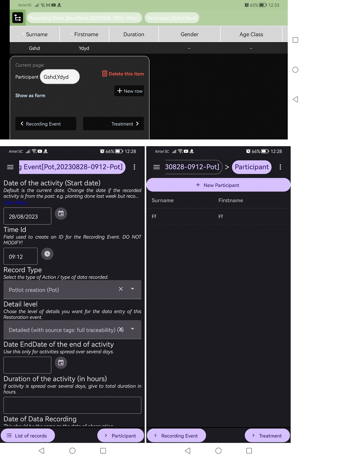
Dear OF team, dear Rajkumar, I thought I could comment on this discussion since I have some related suggestions that came out of trying and testing these two versions of the mobile Arena. I understood (I read it in another post I think) that the unofficial version has as purpose to test functionalities or interface features, for eventual integration into the official app. So in that context, I am listing below some features that I have particularly liked in the unofficial version (MAM) and that I personally would like to see implemented in the "Arena Mobile" official version (AM). I also comment on some other features. -First just to mention features that I do like in the official version: Generally, I like the look, and especially the way the attributes are displayed all with the attribute name, followed by a box that always fills the full width of the screen. The 'description' is not visible for the attributes, and the screen has a nice symmetry. When the user taps on an attribute, this opens in a full screen where we now can see the attribute description, and the elements of a list, also with their description, with nice coloring and nice symmetry. I also very much like the option to set up the "Images quality and sizes", although so far I could not make it work. But it is nevertheless a well needed option considering that most smartphones now easily take photos with far too high resolution for what is needed within an Open Foris use. -My main issue (so far, with what I tested), in the official AM, is about the 'bottom information box', specifically, and the navigation between records and within the hierarchy, in general. I copy paste some screen shot below to explain. In AM, the bottom box (with 'current page', 'delete this item', 'Show as form', 'New row', 'Back to previous entity', 'Go to next entity') is far too big. It occupies more than 35% of my screen height. Firstly, I think that this height is unnecessary since navigation works very well and is very intuitive with the MAM solution (which has just one row of height for the bottom box/line). The top button 'New rows' works fine in MAM, and then the back button allows to quickly get back to a table view. Long tap on a records allows to view the 'delete' option. This all works very intuitively and also corresponds closely with the interface of Open Foris Collect (to which users are already familiar). Secondly, in AM, the oversized and overloaded bottom box may (and does) confuse or distract some users from the most important, which is the list of attributes in the code of the screen. Thirdly, the oversized bottom box becomes very problematic if users turn their phone horizontally, which I believe is an important feature. For example, users will sometimes want to see the entity as a table ('Show as table'), and then they would like to turn the phone horizontally to see as many columns as possible, and at the same time see as many rows as possible. But this does work because in that case the bottom box occupies almost ¾ of the screen height! This function worked so nicely in Open Foris Collect (with the third button to the top right corner of the screen). Having the bottom box reduced to one row, would provide the same advantage in Arena. -In MAM, everything is very clearly readable, while in AM (in both the light and dark themes), I cannot really read 'read only' attributes and the top green line (because of the color contrast of the text). I have seen a couple of posts by others describing the same issue. Read only attributes need to be readable. -Read only attributes should also be 'selectable'. Users may need to copy the read-only code attribute in order to paste it later elsewhere. But this is not possible in AM (it works in MAM). The users should be able to tap the read-only attribute and be able to long-tap and select the text string or part or it. -In both AM and MAM, there is an important feature that was added in Open Foris Collect but is lacking here. For, list attributes, after having selected an element of the list, users should be able to 'unselect' it (in case they change their mind, and actually do not want to pick anything from the list). I hope that this is helpfull. I am available if there are clarifications needed. And I thank you for your help with Open Foris tools. Bruno |
|
Dear Open Foris users, Thanks for your feedback. Here is the changelog of the latest version -> https://openforis.support/questions/3787/openforis-arena-mobile-v1018-release#gsc.tab=0 I hope that you find this new version helpful. Please provide any feedback there. Dear Bruno. Thanks for your detailed feedback. It is a pleasure to adjust Arena Mobile to fulfill your needs and improve the systems to make your work easier. Moreover, your feedback was detailed, and adding some of the topics was easy.
Please let me know if I missed something. Thanks again for your detailed feedback. Dear Rajkumar Rimal, Thank you for your feedback on the 'Open Foris Arena' initiative. You mentioned that MAM excels in responsiveness and integration compared to AM. Could you kindly provide specific detailed examples illustrating these advantages? It would be beneficial. Your insights will significantly assist us in improving the to match the desired sophistication and efficiency. Best Regards, Ramiro |
|
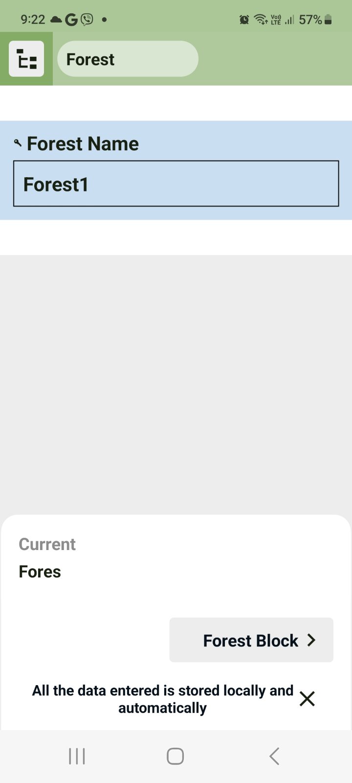
Subject: Compatibility Issue and Appreciation for Arena Interface Dear OF team, I extend my sincere gratitude for your prompt response and the clarification provided. I would like to express my utmost admiration for the exquisite user interface of Arena (AM), which truly reflects the dedication and professionalism of the official team. The aesthetics and functionality of the official Arena interface are indeed commendable and resonate with my personal preferences. However, I have encountered a puzzling inconsistency regarding forms developed in Arena desktop when attempting to open them in the official Arena (AM). Regrettably, this disparity in compatibility diminishes the positive user experience that the beautiful interface aims to deliver. It's important to note that this issue appears selectively in certain forms and not across the board. Curiously, when I endeavor to open the same form in the unofficial Arena (MAM), it functions flawlessly without any hindrance. My primary concern revolves around the seamless synchronization between the desktop and mobile versions of Arena. Achieving compatibility across both platforms should be a priority, allowing for a cohesive user experience. Subsequently, refining the aesthetics and user interface will undoubtedly play a pivotal role in enhancing user engagement. In situations where users encounter compatibility issues with the official version, the alternative may seem uncertain despite the assurance of assistance. As a fervent supporter of the official Arena, I firmly believe that providing a consistent and dependable experience across all platforms is essential to maintaining user trust and satisfaction. I have also attached a screenshot from Arena mobile (AM), which highlights a minor discrepancy in displaying the attribute name. Although this specific issue doesn't pose a significant problem for me as an individual user, it raises questions about the underlying reasons for the inability of forms created in Arena desktop to function within the official area. This contrasts with the successful integration observed in the unofficial arena. My affinity for the official Arena stems from its exceptional attributes, and I am committed to training my fellow crew members to harness its capabilities. I wholeheartedly believe that a resolution to the compatibility matter will greatly amplify our collective productivity and engagement with the platform. Thank you once again for your continued dedication and support. I look forward to witnessing the seamless integration of both the desktop and mobile versions, ensuring that the beauty of the interface is truly matched by its performance. If you want to take the test, I can send my form for testing purposes. Best regards, Rajkumar
you can see here, It is showing Fores instead of Forest. Not only here but on many of the forms. Not always the time but most of the time. |


